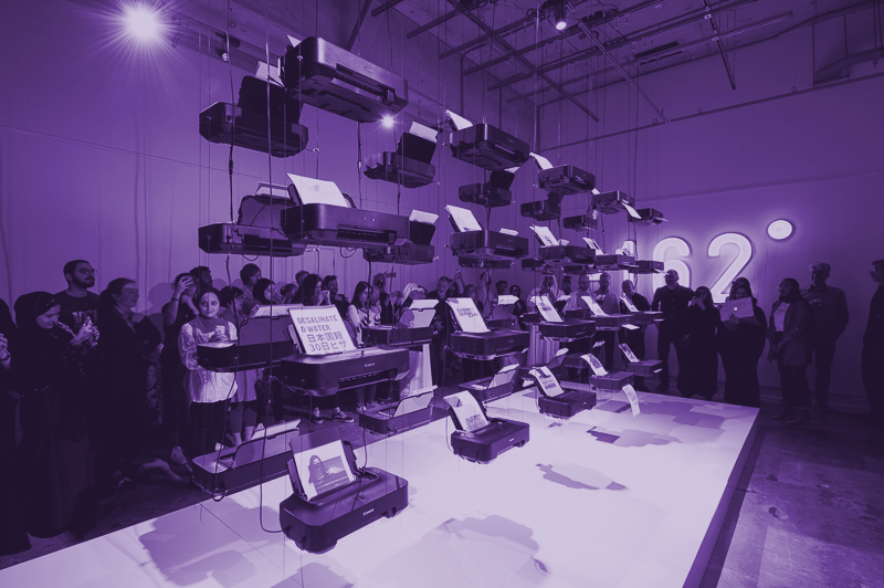
-162° Trading Power is a solo exhibition held at W+K Gallery Space in Tokyo Japan. The 8-day exhibition is part of a collaborative installation project involving five faculty members from VCUArts Qatar, and two faculty members from the Advanced Institute of Industrial Technology in Tokyo. Our collaborative group approached W+K Gallery Space with a proposal for an exhibition, the proposal was accepted by a review board from Weiden & Kennedy Tokyo, a well-known international design agency. The W+K Gallery Space hosts exhibitions from international artists, typically with emphasis in experimental design making practices.
-162° Trading Power is an 8-day exhibition / collaborative installation project involving five faculty members from VCUArts Qatar, and one faculty member from the Advanced Institute of Industrial Technology in Tokyo, one faculty member from Texas A&M University at Qatar, and three student contributors and one staff contributor from VCUArts Qatar. The installation is version 2.0, a second iteration from a previous exhibition in Tokyo, Japan. The Doha exhibition was reviewed and accepted by the Doha Fire Station, and is part of Tasmeem Doha 2019 Heykayat.
The Contemporary Art Qatar exhibition presented by Qatar Museums at Berlin’s Kraftwerk, a 7,500 sq. m former power plant, was the largest international survey of contemporary art from Qatar. “It is an important time for our country. And a wonderful moment to be able to celebrate the true friendship between Qatar and Germany,” says Sheikha Al Mayassa bint Hamad bin Khalifa Al Thani, the chairwoman of Qatar Museums (QM) .
"294 works from 73 artists looking at the rapid transformation of Qatar and its society. Both Qatari citizens and artists who are based—or have produced work—in the country will be exhibited. “We are proud of the extraordinary talent of the new generation of artists emerging in Qatar, both those of Qatari nationality, but also the artists we welcome from other parts of the world,” Sheikha Al Mayassa says. Around 86% of Qatar’s population are migrants."
- From the Art Newspaper (http://bit.ly/2Bbbco7)
We presented the Kalimat project in the form of an exhibition to further extend the visual language across multiple media. Included in the show are the book, selected process images, framed images from the book, the posters, video and tumblr along with exhibition graphics and badges.
The process of design is not only driven by question and answer, problem and solution, in a linear way. This project introduces students to making as the starting point for the generation and discovery of a problem or relevant question. This course turns the typical design process around allowing for meaning to be generated as a consequence of collection, organisation and presentation where narrative may follow as a consequence of process. Kalimat is the outcome of the MFA in Design’s Visual Communication course at VCUQatar.
kalimat17.tumblr.com
“Sarah Takes a Selfie”
Inkjet on Silk / C-Type Print, 30 x 40cm
Photograph & Silk scarves by: Nathan Ross Davis
Modeling by: Sarah Elawad
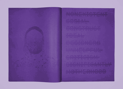
Oppositional identities are stabilized by the perception of difference. Whatever cracks in this facade may arise are minimized by the desire to hold on to one’s own stable position within the relationship. As a designer and professor in the Gulf, teaching young muslim women the values of Western design ideology, we live a daily dialectic exchange, where we hold the past, the traditional, the conservative, the negation of the female image alongside the completely contemporary phenomenon of hyper self-awareness, social digital identity, social critique and flexible gender identity.”
“As we collaborate, we find ourselves surrounded in all directions by inconsistencies and contradictions that neither can be, nor ask to be solved. The contradictions require us to allow them to coexist, and so we continue without rational explanation. This irrational daily dialog of lives is a condition that we explore alongside our acceptance of it. There are few venues in our region for outright criticism and critical dialog, but between the lines of conversation, while we celebrate our differences, we are also interrogating the truth of our apparently oppositional identities which we inherited before our meeting. It is a productive act, it destabilizes our assumptions, and builds new ones. It proposes an alternative future, it is quiet but monumental.
This is a series of posters based on visual languages adapted from local consumer items, comic books, and carpets from the Sheikh Faisal Bin Qassam Al-Thani Museum. All three are grant supported by VCUQatar and part of an experimental publishing project that I started called water with water / فسّر الماء بالماء
I had the great pleasure of attending the awards ceremony and the gala event for the Red Dot award in Berlin. Unfortunately Sara Shaaban (who won two awards!!) was unable to attend so I had to go alone. Of course I met interesting designers and had a moment of satisfying accomplishment before heading back to Doha to start on the next project.
The exhibition took place at ewerk berlin, and featured physical samples of the winning works.
Since my engagement designing for the Tasmeem conference I began to speculate on projects that would allow me to further explore the local visual language and to contribute to the visual culture of Qatar. Initially I began using a collection of rocks from my neighborhood to design patterns that were based on Islamic geometry. This work was exhibited in the second Faculty Show printed on silk scarves. I continued the work and expanded the visual language to include more representational images. This more representational work was exhibited in the Strange Wonders exhibition at the Msherib Company House gallery.
As a consequence of this new work I was invited by the curators to design a majilis that would be installed in the gallery functioning both as a work in the show but also as seating for visitors. This work has lead me to continue my research in this way, with an interest in showing work that is generated from a local visual language but is disseminated also outside the region.
Because of these activities I was able to have an article about my work featured in the Gulf Times, which is certainly not a widely read international periodical, but in many ways it has a more relevant impact here because it reaches a non-specialized audience in the region. For my research approach right now, this may prove to be more important and rewarding.
The brief documentary we produced was exhibited in Hong Kong at the Hong Kong Design Institute along with a modified version of the original exhibition from Zurich. Don Adleta, the project director also gave a lecture which I was fortunate enough to attend and document.
Wonderfully relentless and monotonous, these rocks from vacant lots in Doha, produced by geologic time and unearthed by ongoing construction are presented in GIF time. This is a monumental rip-off. Fast, frenetic and detached.
From the Editor “The reference book for contemporary design presents today’s best projects in communication design on more than 1,000 pages. Browse through the latest developments in the industry and behold innovative works and outstanding campaigns from the fields of advertising, marketing and more.”
“Volume 1 comprises the wide range of creative achievements in corporate design, brand design, packaging design, advertising, annual reports, publishing & print media, posters, typography, illustrations and social responsibility.”
This is the first in a series of six silk scarves that I designed and printed in 2016. The intended display is different than what was allowed in the gallery. The images of how I prefer to display them are below, but it made the curators nervous, so we compromised. There was an article written about the show that featured the exhibition, and an article a week later which featured some of my older creative work.
In 2013 I was invited to the Azores to document a private meeting of Basel School of Design alumni and prof. Emeritus Wolfgang Weingart. The purpose of the gathering was to articulate fundamental ideas in Weingart's teaching philosophy as experienced and translated through his students. The discussions included 4 days of shooting including meetings, and interviews. These were cut into two short documentary films which are now featured in the "Weingart Typography" exhibition curated by Barbara Junod at the Museum fur Gestaltung in Zurich. The exhibition subsequently traveled to the Hong Kong Design Institute, and other venues.
On our co-chaired panel at the Foundations in Art, Theory and Education conference "Tectonic Shifts," Jesse Payne and I proposed a debate between technique and concept.
I was originally on the side of concept, but unfortunately one of our panelists dropped out at the last minute and I had to switch sides. In this series of five-minute Pecha Kucha style presentations presenters are asked to take a side and make a stand and argue polemically. I think in the end I may have convinced myself. Since this panel and presentation, I have been repeating over and over to students: "It doesn't matter WHAT, it matters HOW."
Are particular cultural identities expressed through vernacular typography? Is there is such as thing as “typography of place?” How can a “type of place” be defined in today’s more globalized cultures?
Typography is the art of arranging type in order to make language visible. Our project, Type of Place, set out three years ago documenting and archiving vernacular typography around the world with an aim to discover if there is such as thing as “typography of place” and how that can be defined in today’s more globalized world.
Historically there are many examples of culturally specific graphic forms. Design in general is considered a cultural indicator, for example, French fashion design, Italian furniture design, Swiss graphic design, Japanese ceramics etc. Our project investigates this concept through the lens of typographic design.
As an ongoing grant funded research project, we are currently designing a mobile application that will allow the development of a user generated collection of vernacular type from all over the world. This project is fundamentally comparative. While this is still a main tenant of our work, we also feel that the collection and archiving of vernacular forms by users in their own community is important as an end in itself. We realize that there would be a significant research value in having a photographic archive of vernacular typography for example from the 40’s, 50’s 60’s etc. Unfortunately no such systematic collection currently exists.
This project began at ATypI in Reykjavik, and was subsequently presented at DesignMarch in Reykjavik in 2012, ATypI Barcelona 2014, Typecon Denver 2015, FaceForward Dublin 2015.
Type of Place is a collaboration with Meta Newhouse.
Access is a concise term used to describe a complex system of relationships that either include or exclude based on some form differentiation.
Design inquiry is a very specific group of designers who share a similar creative and community impulse, who gather to discuss ideas of similar interest with a sympathetic and curious approach to design thinking. Access to Design Inquiry in this sense is used to limit participation in the event to a group of like-minded and similarly motivated individuals
in order to produce a shared experience that is of mutual benefit.The stated goal of disseminating the experience is not about replicating the experience for others but instead sharing the results with larger, less specific audiences.
In light of this, I propose as a counter point, to invite members of the local community to come participate in a social and conceptually structured “open house.” In doing such, we test the notion of access, and make an effort to share our conversation with a community, which may or may not share similar interests.The two images that I am associating with this proposal are initial sketches of invitations based on the idea of a social gathering where the DI group “hosts” the members of the community. I am curious to see how this act of sharing something specific with a more general audience will influence our conversations and thoughts about access throughout the rest of the week.
This is also a good time to recognize the 10th year of DI in Vinalhaven. Budget, timing, participant interest etc. will all play a part in what this becomes. I am open to suggestions from DI veterans who have an idea about how to make this happen, or how to structure the event itself.
Now you can sit around the flickering flame of your HD television and enjoy the artifice of nature with high quality bass. No need to go camping! The SubLog is a 79"x 18" life size cast of an oak log from the forest of Marin County, CA. This log is a subwoofer which uses a sealed box design with audiophile quality components to produce natural flat sound replication. It was designed specifically for home theater applications. It contains a dynamic EQ and has many custom controls.
The AIGA sponsored panel at the College Art Association in 2013 was all about participatory design. Following up on the publication of their fantastic book Participate: Designing with User Generated Content, published by Princeton Architectural Press, Zvezdana Stojmirovic and Helen Armstrong put together a panel of contributors from the book to discuss the implications of participatory design in professional practice and design education.
I was honored to be invited to present. My presentation focused on the act of editing and creating meaning out of the increasing quantity of user generated content. Here are some spreads from the Zine that they made for the conference. I referenced a project by one of my favorite design firms in Amsterdam, studio moniker, founded by Luna Maurer & Roel Wouters.
HonnunarMars, Reykjavik Iceland 2012
The inflated form represents the volume of air that the average adult breathes in a twenty-four hour period. The prints on the wall represent the number of breaths that the average adult takes in one hour. This project was part of the DesignMarch festival in Reykjavik Iceland. Its purpose was to pose the question about how information is experienced and presents a way of making a universal experience into a visualized poetic space.
Air Hunger: The subjective experience of breathing discomfort that consists of qualitatively distinct sensations that vary in intensity. The dysfunctional machine. The persistence of constant exchange. The uncomfortable awareness of breathing. The automatic action is the most important action. The experience of air hunger, is a real experience that asks the body to forget all other abstractions. It is at once beautiful in it’s simplicity and oppressive in it’s totality and finality.
A collection of videos documenting Don Adleta, Professor Emeritus, working through the process of bringing a letter form to life from blank paper, pencil sketches, then eventually paint. This document captures some of the traditional processes of letterform design and the methods that were taught at the Weiterbildungsklasse fur Grafik in Basel Switzerland.
Mission Bay San Francisco
36"x24", Color Photograph, C-type Print, 2006
Images of a miniature 2'x3' set constructed in my studio, then photographed. These are explorations of beauty and illusion using common local urban weeds. The illusions break down in each image, but only after the initial impact. Perception and expectations guide our placement of value just as these images transform unwanted urban vegetation into art objects.
24"x36" Lambda c-type prints
The Scanned Wood project began by collecting pieces of rotting wood in the forest of southern Ohio. The pieces were then scanned using a 3D scanner. Using CAD based software, the detail of the geometry is reduced, and the vectors are then drawn with pen on news print and drawing paper respectively.
For me the mediation and translation is the most valuable component of the final work. Each could be printed, but the use of human hand to recreate the computer's lines, that were generated from a natural object creates a compelling though anachronistic relationship of contemporary media and hand made processes.