


Are particular cultural identities expressed through vernacular typography? Is there is such as thing as “typography of place?” How can a “type of place” be defined in today’s more globalized cultures?
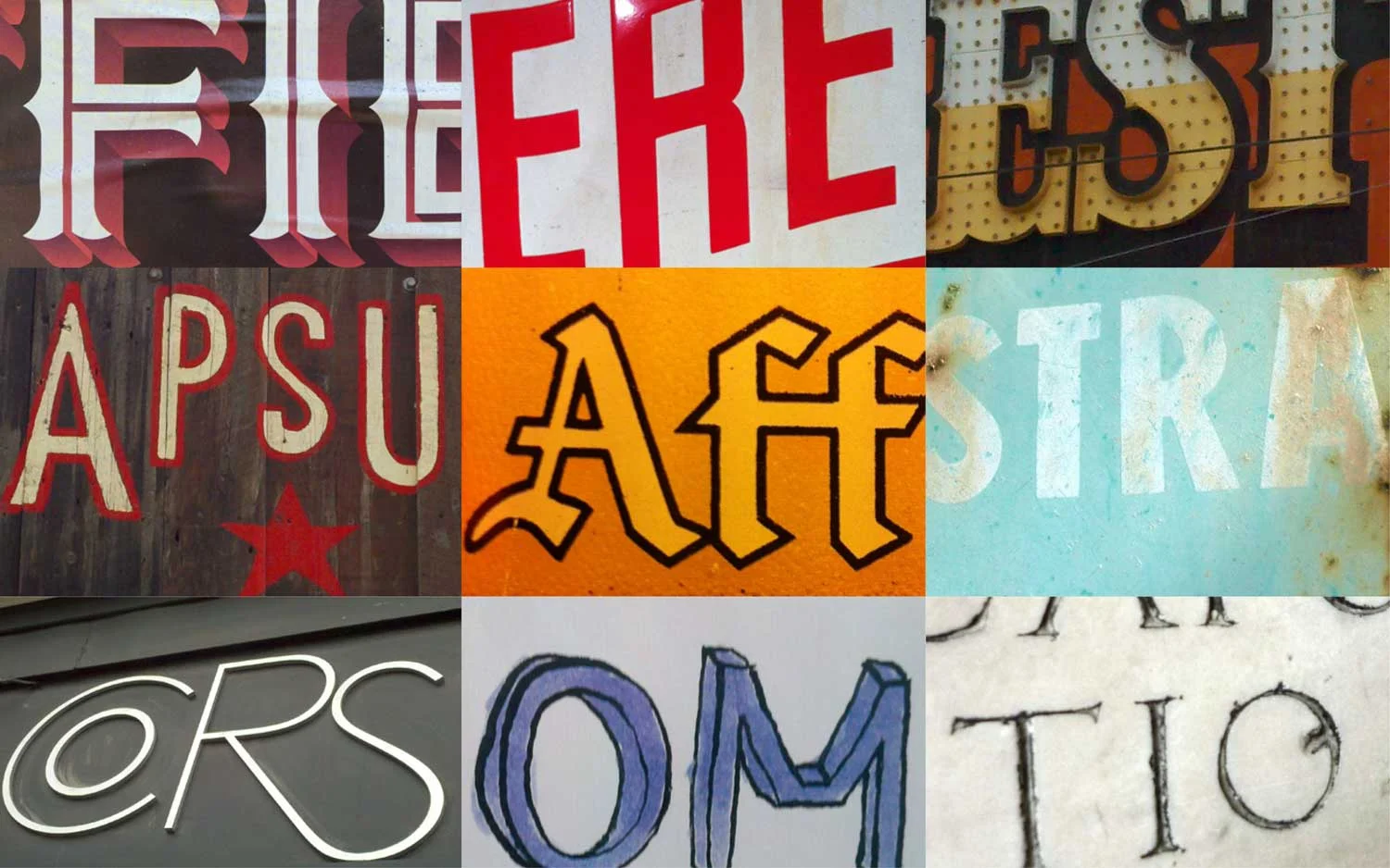
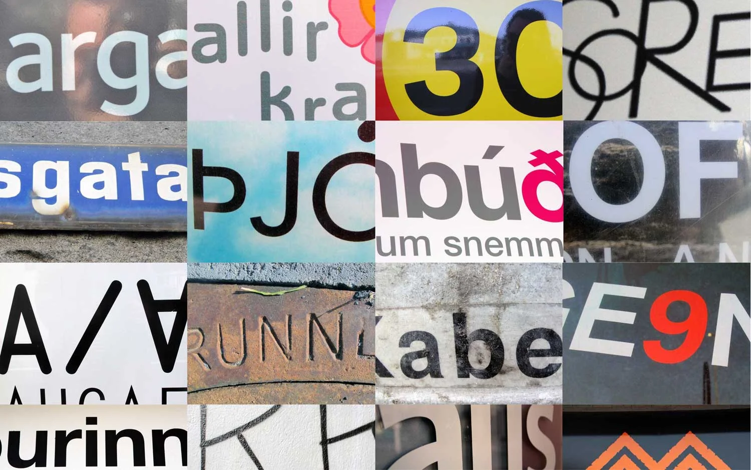
Typography is the art of arranging type in order to make language visible. Our project, Type of Place, set out three years ago documenting and archiving vernacular typography around the world with an aim to discover if there is such as thing as “typography of place” and how that can be defined in today’s more globalized world.
Historically there are many examples of culturally specific graphic forms. Design in general is considered a cultural indicator, for example, French fashion design, Italian furniture design, Swiss graphic design, Japanese ceramics etc. Our project investigates this concept through the lens of typographic design.
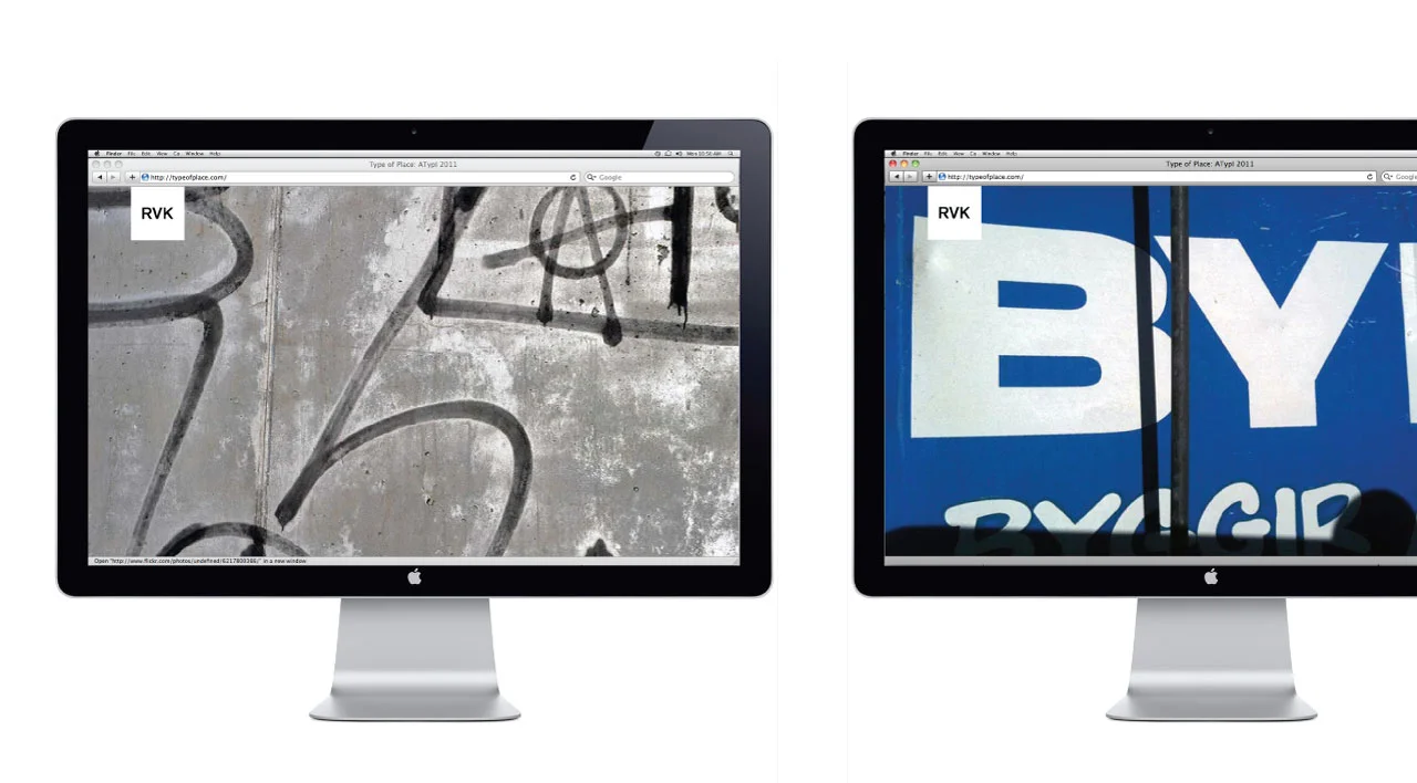
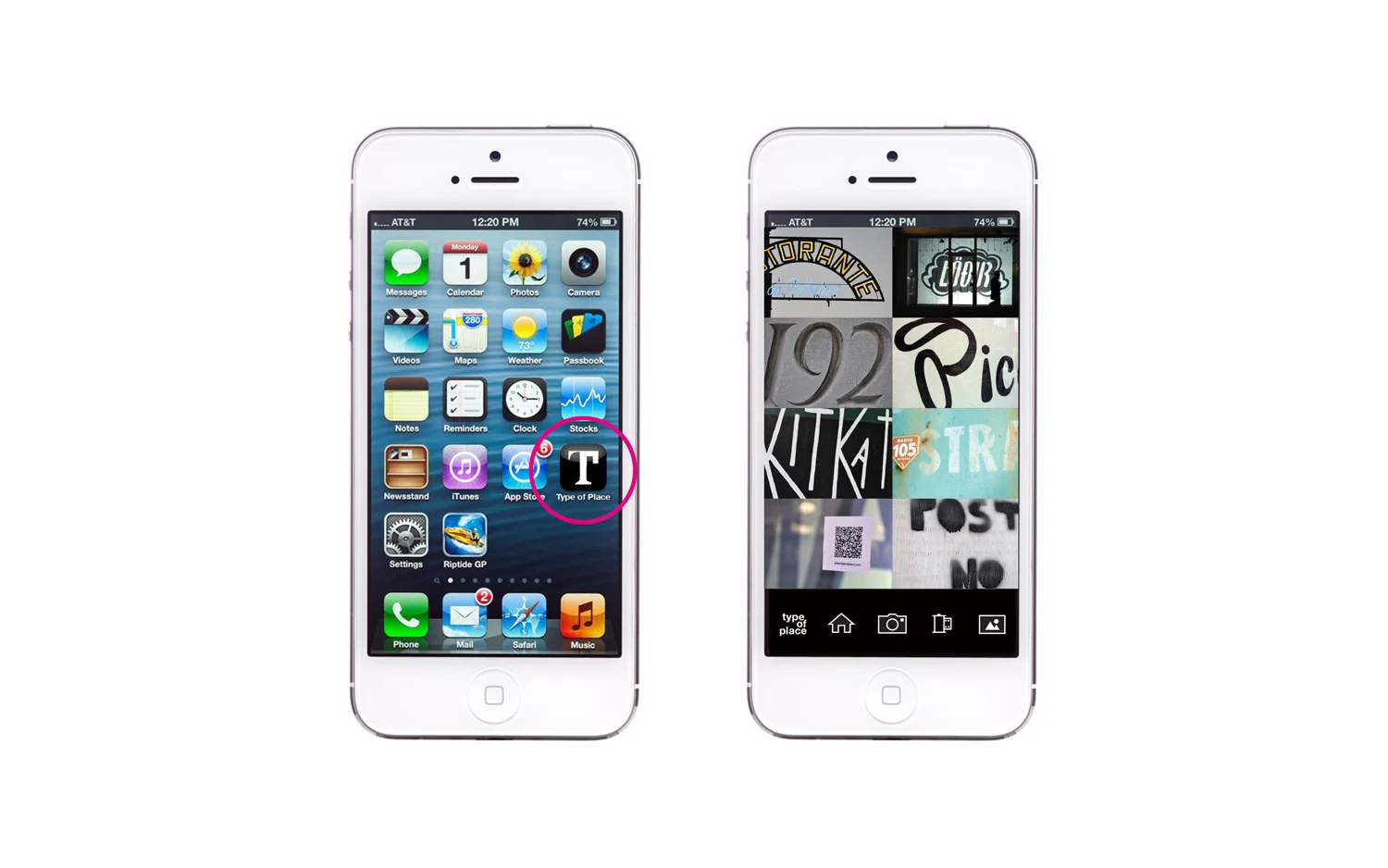
As an ongoing grant funded research project, we are currently designing a mobile application that will allow the development of a user generated collection of vernacular type from all over the world. This project is fundamentally comparative. While this is still a main tenant of our work, we also feel that the collection and archiving of vernacular forms by users in their own community is important as an end in itself. We realize that there would be a significant research value in having a photographic archive of vernacular typography for example from the 40’s, 50’s 60’s etc. Unfortunately no such systematic collection currently exists.
This project began at ATypI in Reykjavik, and was subsequently presented at DesignMarch in Reykjavik in 2012, ATypI Barcelona 2014, Typecon Denver 2015, FaceForward Dublin 2015.
Type of Place is a collaboration with Meta Newhouse.